반응형
jQuery ui를 사용하여 tooltip 구현하는 방법을 알아보겠습니다.
jQuery ui를 다운로드하여 사용하시려면 아래 링크에서 버전 확인 후 다운로드하여주시면 됩니다.
jqueryui.com/download/#! version=1.11.4
Download Builder | jQuery UI
Download Builder
jqueryui.com
[사용 방법]
jQuery-ui.css 파일과 jqurey.js, 그리고 jquery-ui.js를 추가해줍니다.
<link rel="stylesheet" href="//code.jquery.com/ui/1.12.1/themes/base/jquery-ui.css">
<script src="https://code.jquery.com/jquery-1.12.4.js"></script>
<script src="https://code.jquery.com/ui/1.12.1/jquery-ui.js"></script>
다음은 js영역에 선언해주시면 끝입니다 :)
$( function() {
    $( '대상' ).tooltip();
  } );
그리고 css를 사용해서 커스텀하는 방법입니다.
[결과 화면]

코드
<!doctype html>
<html lang="en">
<head>
<meta charset="utf-8">
<meta name="viewport" content="width=device-width, initial-scale=1">
<title>jQuery UI Tooltip - Custom Styling</title>
<link rel="stylesheet" href="//code.jquery.com/ui/1.12.1/themes/base/jquery-ui.css">
<link rel="stylesheet" href="/resources/demos/style.css">
<script src="https://code.jquery.com/jquery-1.12.4.js"></script>
<script src="https://code.jquery.com/ui/1.12.1/jquery-ui.js"></script>
<script>
$( function() {
$( document ).tooltip({
position: {
my: "center bottom-20",
at: "center top",
using: function( position, feedback ) {
$( this ).css( position );
$( "<div>" )
.addClass( "arrow" )
.addClass( feedback.vertical )
.addClass( feedback.horizontal )
.appendTo( this );
}
}
});
} );
</script>
<style>
.ui-tooltip, .arrow:after {
background: black;
border: 2px solid white;
}
.ui-tooltip {
padding: 10px 20px;
color: white;
border-radius: 20px;
font: bold 14px "Helvetica Neue", Sans-Serif;
text-transform: uppercase;
box-shadow: 0 0 7px black;
}
.arrow {
width: 70px;
height: 16px;
overflow: hidden;
position: absolute;
left: 50%;
margin-left: -35px;
bottom: -16px;
}
.arrow.top {
top: -16px;
bottom: auto;
}
.arrow.left {
left: 20%;
}
.arrow:after {
content: "";
position: absolute;
left: 20px;
top: -20px;
width: 25px;
height: 25px;
box-shadow: 6px 5px 9px -9px black;
-webkit-transform: rotate(45deg);
-ms-transform: rotate(45deg);
transform: rotate(45deg);
}
.arrow.top:after {
bottom: -20px;
top: auto;
}
</style>
</head>
<body>
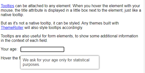
<p><a href="#" title="That's what this widget is">Tooltips</a> can be attached to any element. When you hover
the element with your mouse, the title attribute is displayed in a little box next to the element, just like a native tooltip.</p>
<p>But as it's not a native tooltip, it can be styled. Any themes built with
<a href="http://jqueryui.com/themeroller/" title="ThemeRoller: jQuery UI's theme builder application">ThemeRoller</a>
will also style tooltips accordingly.</p>
<p>Tooltips are also useful for form elements, to show some additional information in the context of each field.</p>
<p><label for="age">Your age:</label> <input id="age" title="We ask for your age only for statistical purposes."></p>
<p>Hover the field to see the tooltip.</p>
</body>
</html>
반응형
'Web > jquery' 카테고리의 다른 글
| 아이프레임 (iframe) 높이 자동 조절하기 (0) | 2021.04.16 |
|---|---|
| [Bootstrap] 부트스트랩 시작하기 및 사용 방법 (0) | 2021.04.14 |
| jquery 이벤트가 익스플로러(ie)에서 실행 안될 때 해결방법 (0) | 2021.03.30 |
| [JQUERY] slick slider 이미지 슬라이드 플러그인 설치 및 사용법 (0) | 2021.03.29 |
| 웹접근성을 준수한 탭메뉴 jquery (0) | 2021.03.28 |